[Case 04]
antimattr[.]one
Artificial Intelligence & HCI
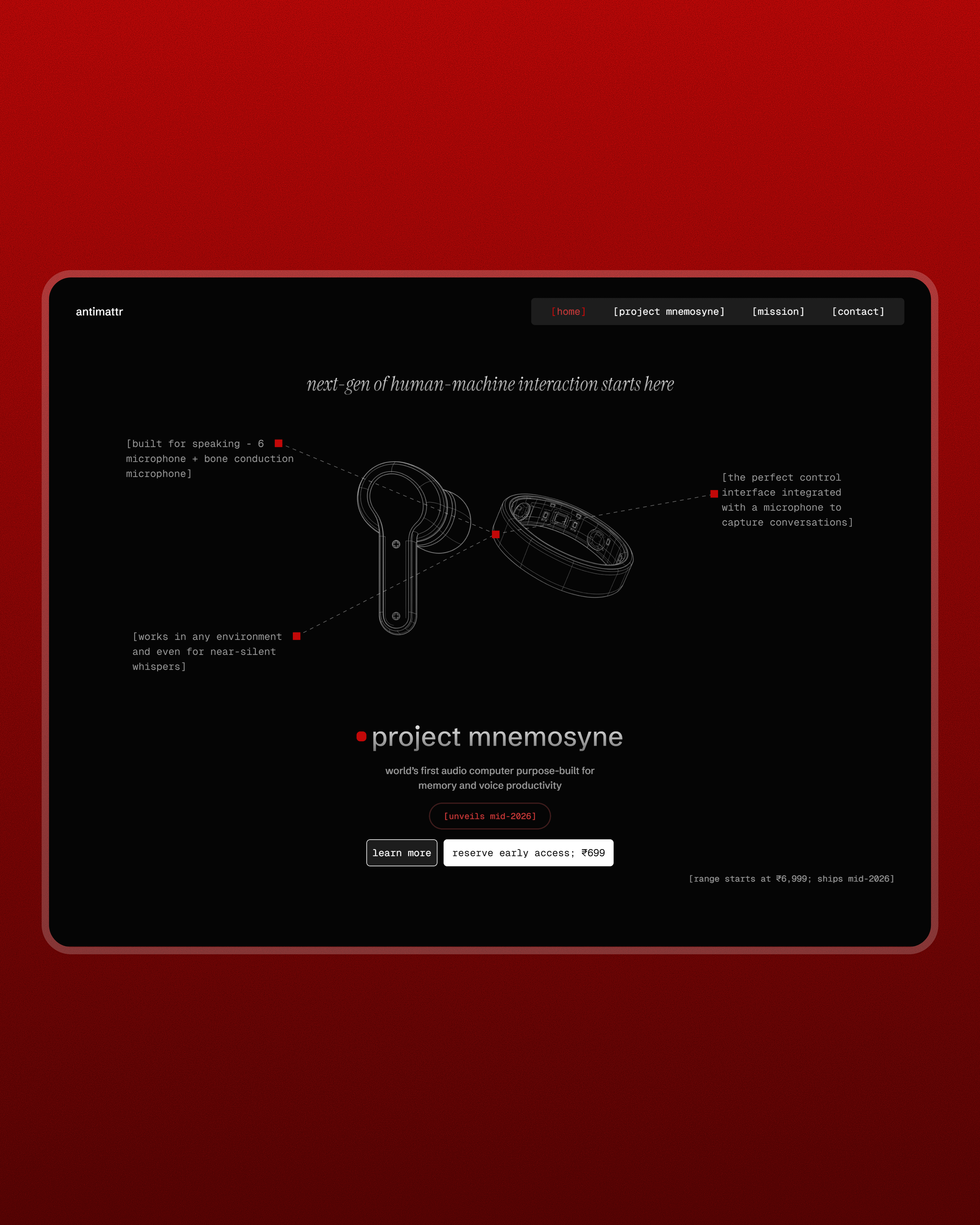
Designing trust in the unseen
Building premium trust through technical blueprints and strategic storytelling for an AI hardware startup.
[Project Overview]
Bridging the "Visual Void" with technical transparency and roadmap storytelling to build high-end brand trust. By replacing missing photography with engineering-first visuals, I transformed a skeptical user journey into a premium experience that drives high-intent reservations.
[Problem Statement]
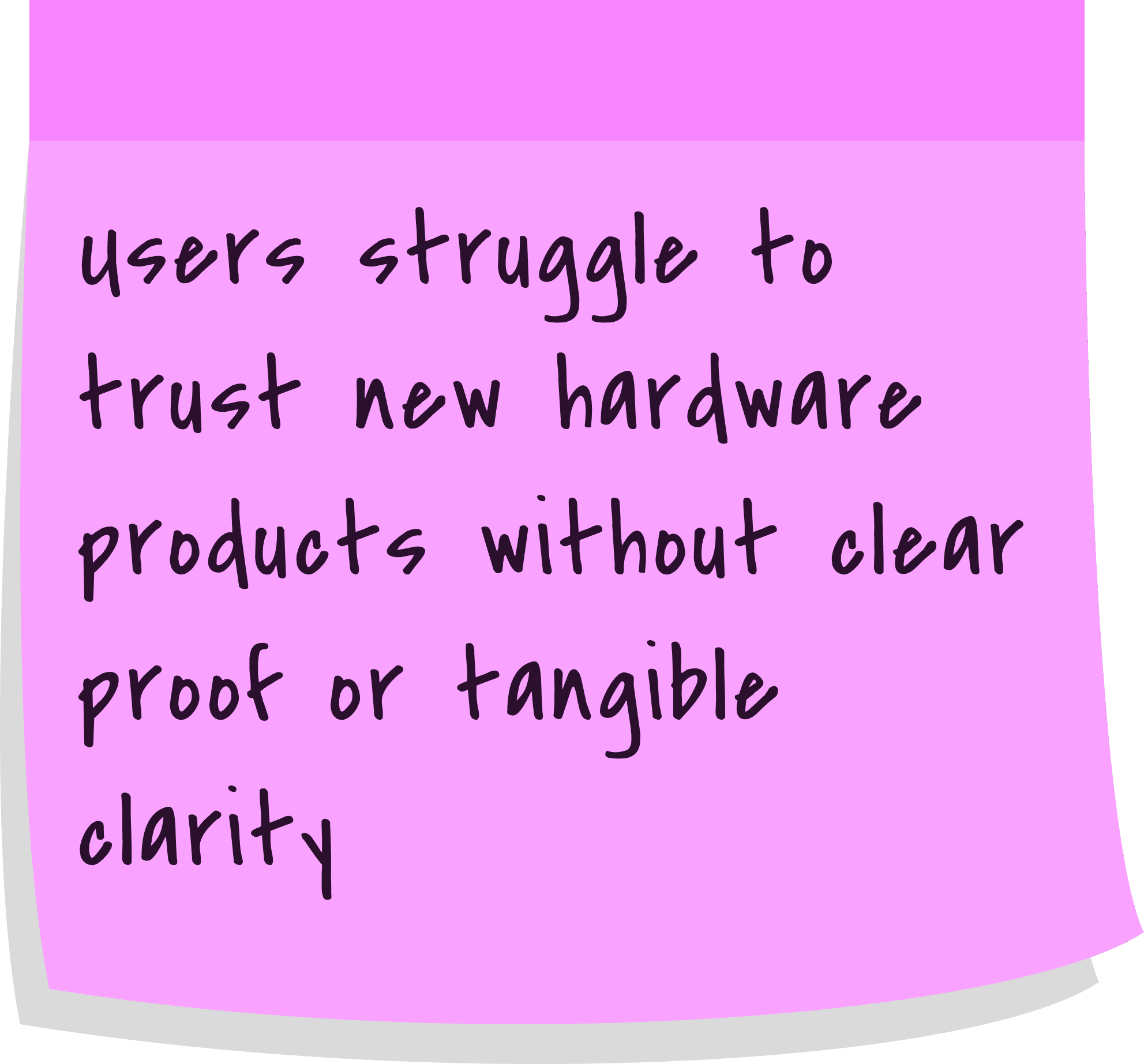
Most startups struggle to gain trust before they have a physical product to show. For Antimattr, the stakes were even higher because the technology is complex and the hardware is still in development. Traditional landing pages often rely on glossy photos to feel real, but without those, we faced the risk of looking like vaporware.
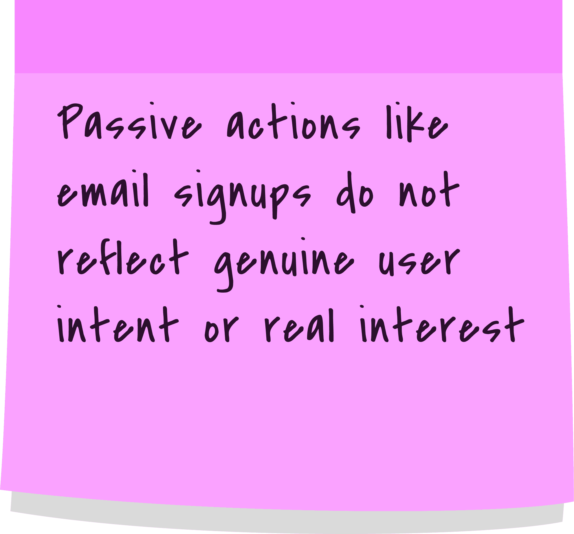
Our goal was to validate whether there was genuine demand for the product. Initially, we relied on an email waitlist, but we quickly realized it generated inflated interest since anyone could join with minimal effort. Another goal was that we had to convince users to invest in a future concept by making the engineering feel tangible and the brand mission feel inevitable. This required a design that valued deep technical honesty over flashy marketing.
[Industry]
Artificial Intelligence & HCI
[My Role]
Product Design Intern
[Platforms]
Desktop & Mobile
[Timeline]
Jan 2026 - Mar 2026
[Persona]
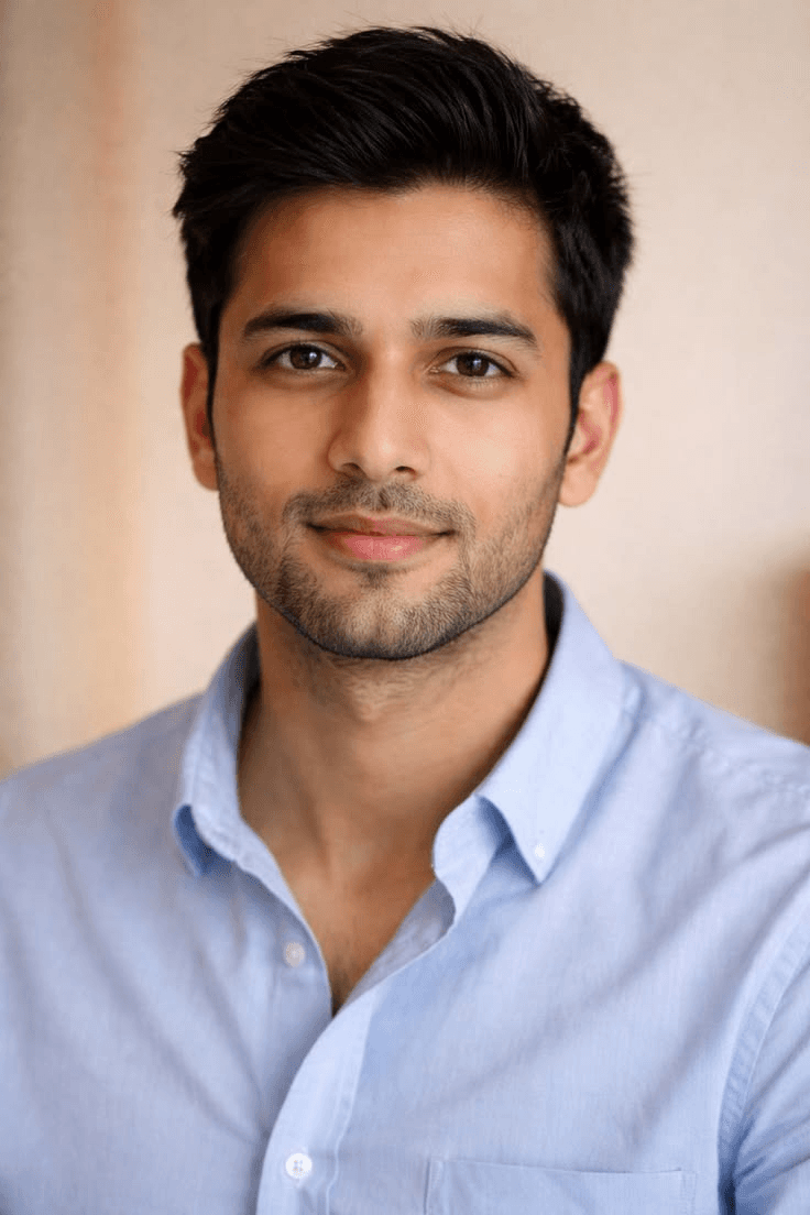
Arjun Mehta
Senior Product Manager at a Fintech firm
He is the hardest user to convert because he demands physical evidence to grant trust.
Age: 29
Location: Bengaluru, India
Tech proficiency: High / Critical
Gender: Male
[Expectations from a website]
He expects the interface to be as high-quality as the premium hardware it claims to sell.
He values radical honesty about the development stage over generic marketing fluff.
He wants a logical flow that respects his intelligence and doesn't just "push" him to a checkout button.
[Goals on the website]
To find a "reason to believe" in a company that doesn't have a physical product to show him yet.
To judge the credibility of the founders by the depth and "seriousness" of the website’s information.
To understand if the ₹699 reservation is a legitimate entry into a future ecosystem or just a gamble.
[Current pain points]
A lack of product photography makes the hardware feel imaginary and erodes his trust.
Hype Fatigue — He is tired of landing pages that use vague "AI" buzzwords but offer no substance on how the technology actually works.
Commitment Anxiety — He is hesitant to pay a reservation fee for something that feels like "vaporware" or a project that might never ship.
[Core browsing behaviors]
He is a "skeptical skimmer" who will leave the site in 10 seconds if it looks like a generic template.
He looks for technical details to compensate for the missing photos—he wants to see "evidence of thought."
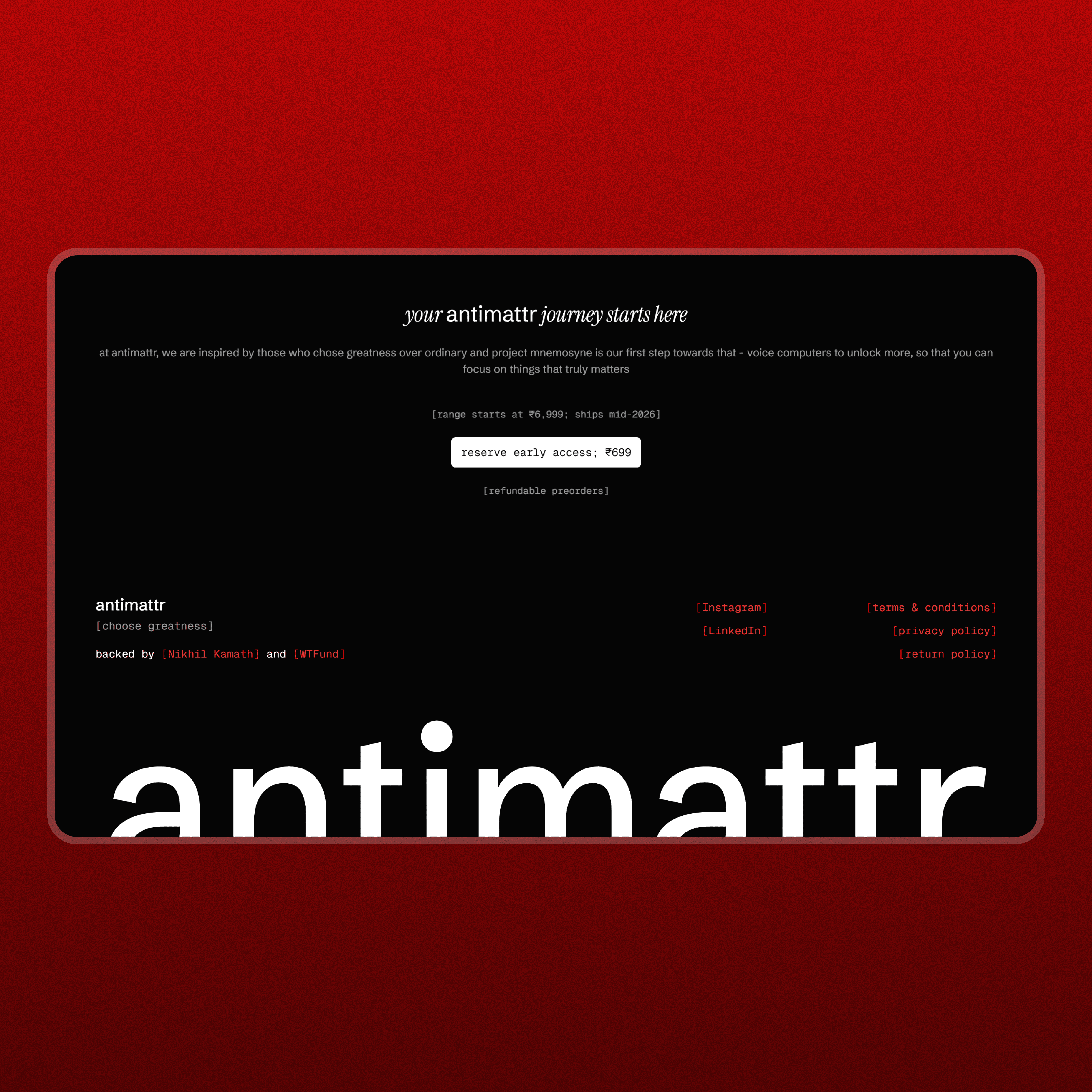
He checks the navigation links like "Mission" or "Roadmap" to see if the company has a plan beyond just a single landing page.
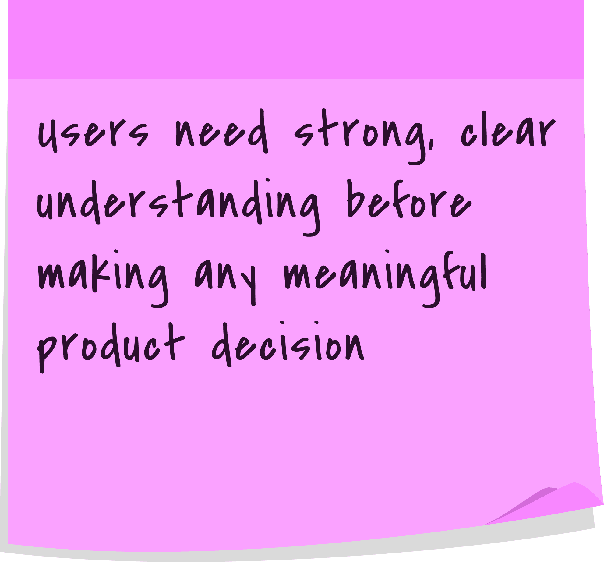
[Key Insights (Problem Statement + User Persona)]
[Process]
[01] Strategic Discovery
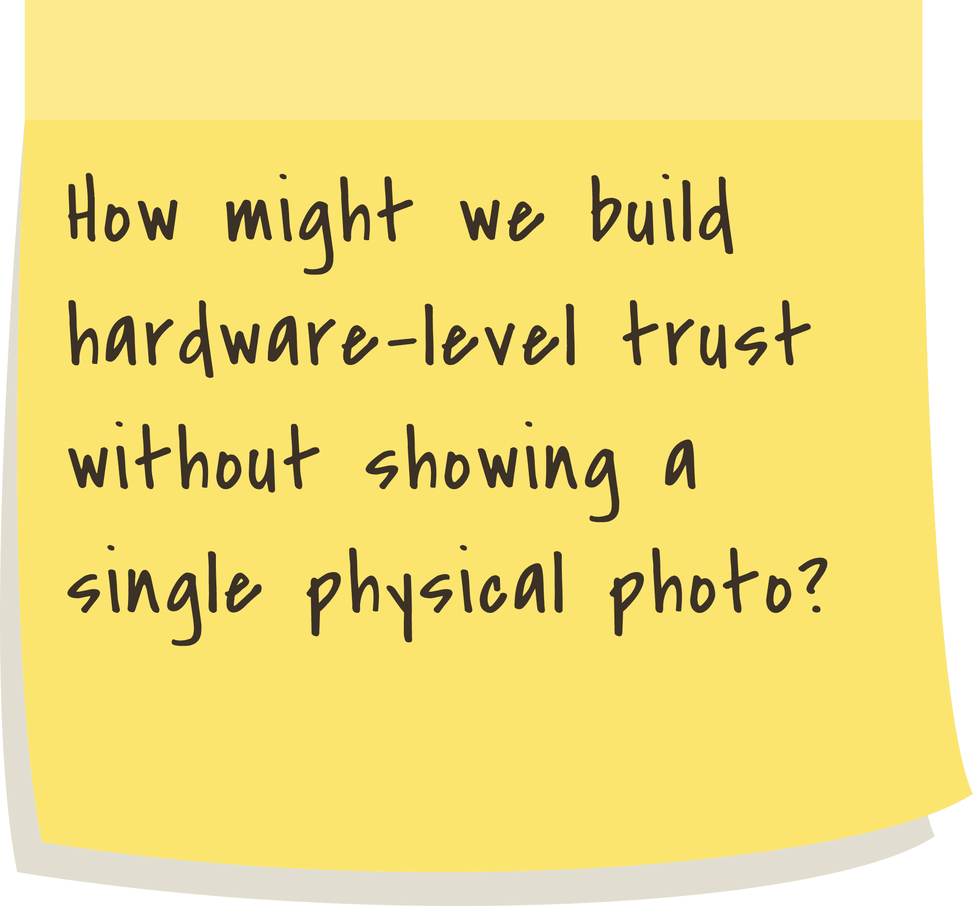
Identified the Visual Void as the primary barrier to user trust due to the lack of physical product photography.
Defined the Skeptical Professional to identify the specific proof required to convert high-intent users.
Analyzed competitor "AI wearables" to find gaps between technical reality and marketing hype.
[02] Behavioral Architecture
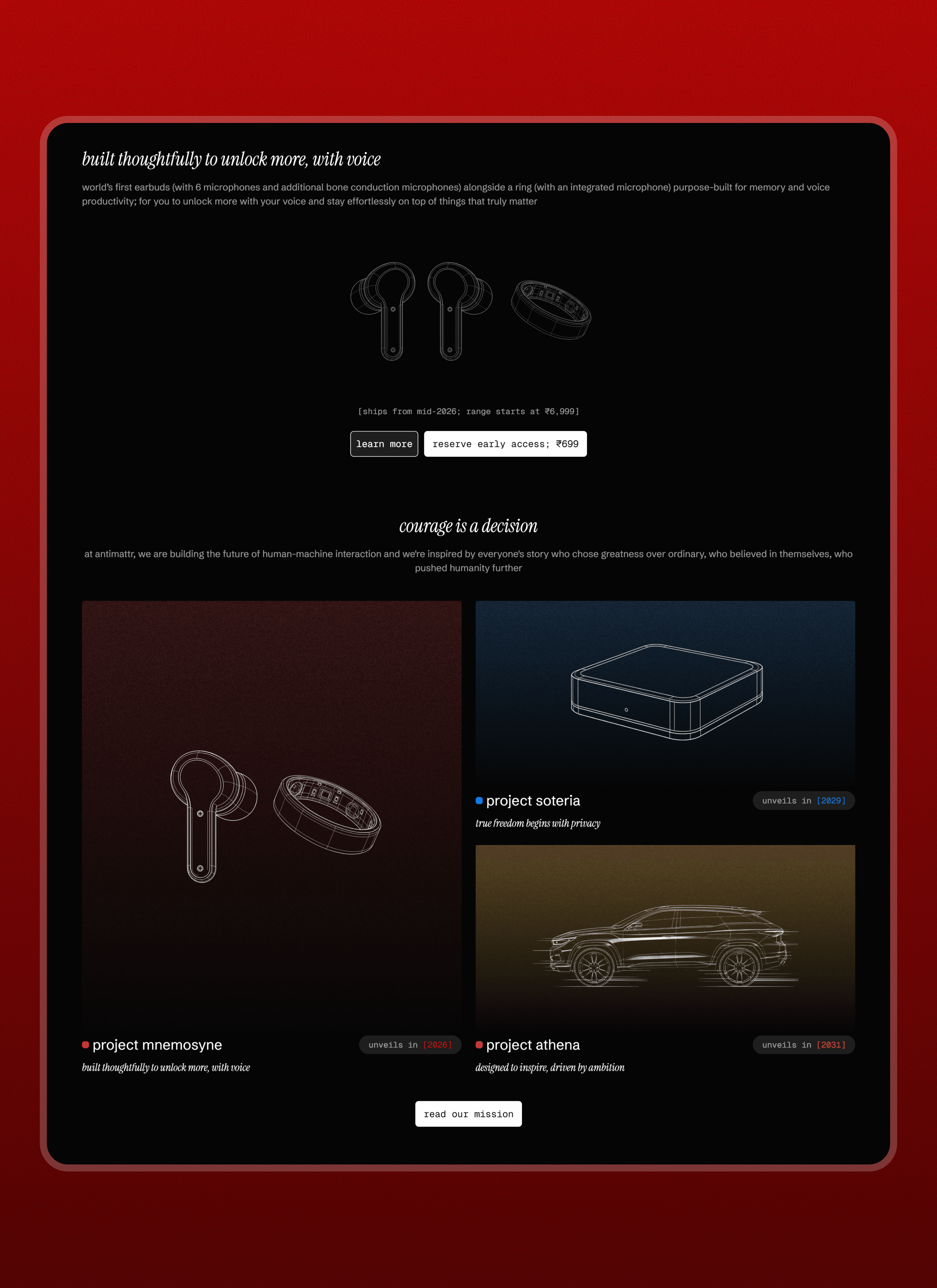
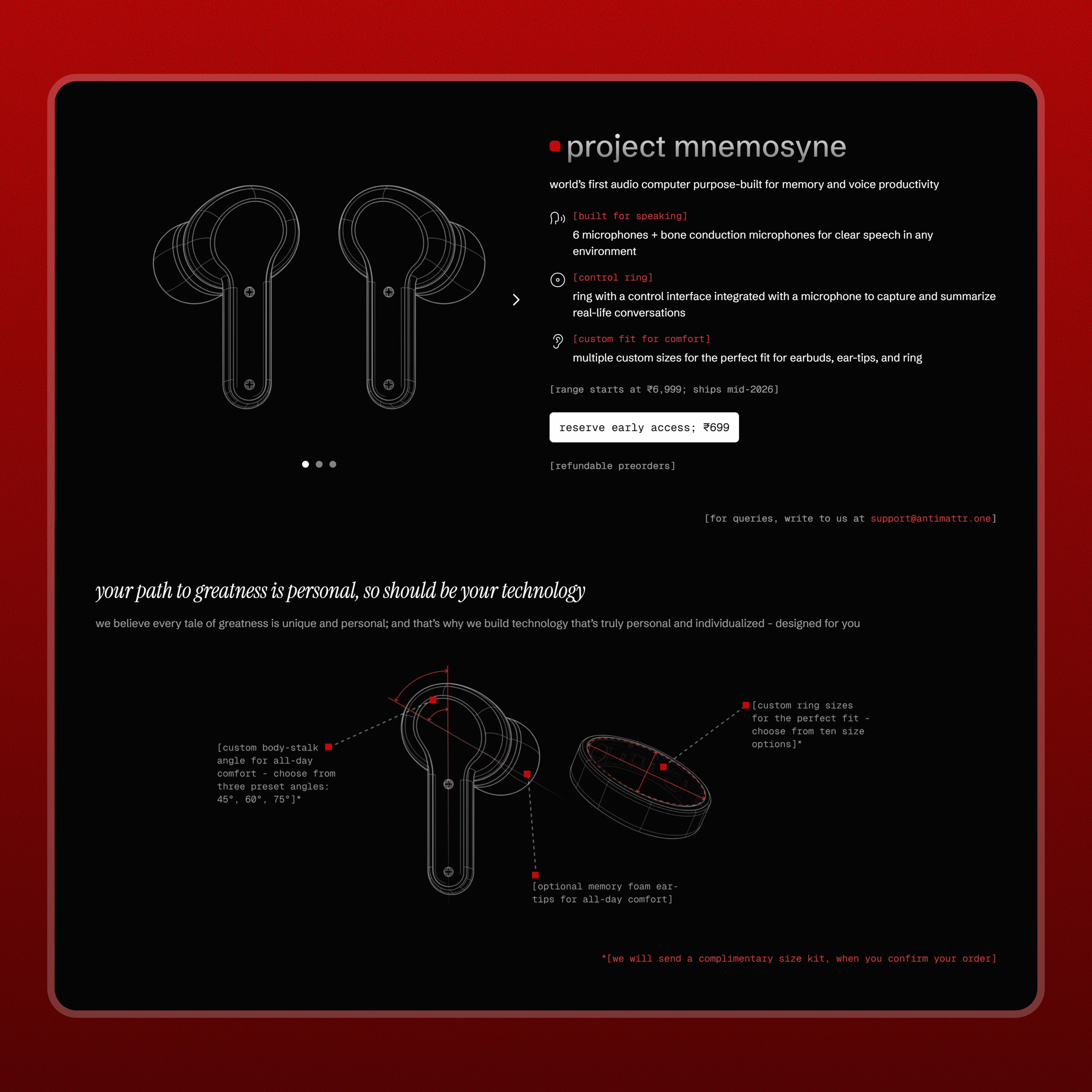
Transparency by replacing missing photos with "engineering-first" visuals that prove the hardware exists.
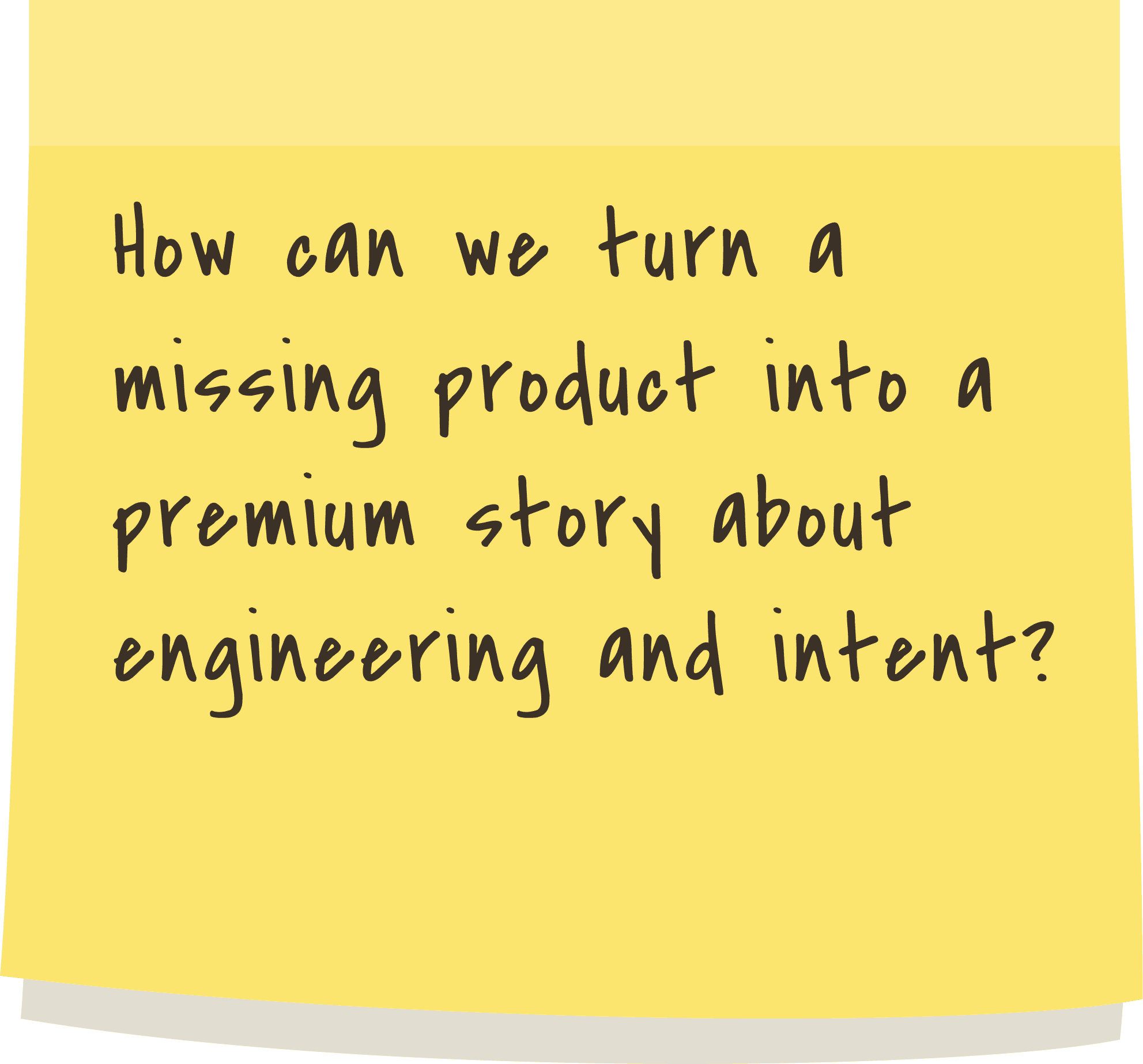
Mapped out a Narrative-Led Roadmap to shift the focus from a single missing product to a decade-long mission.
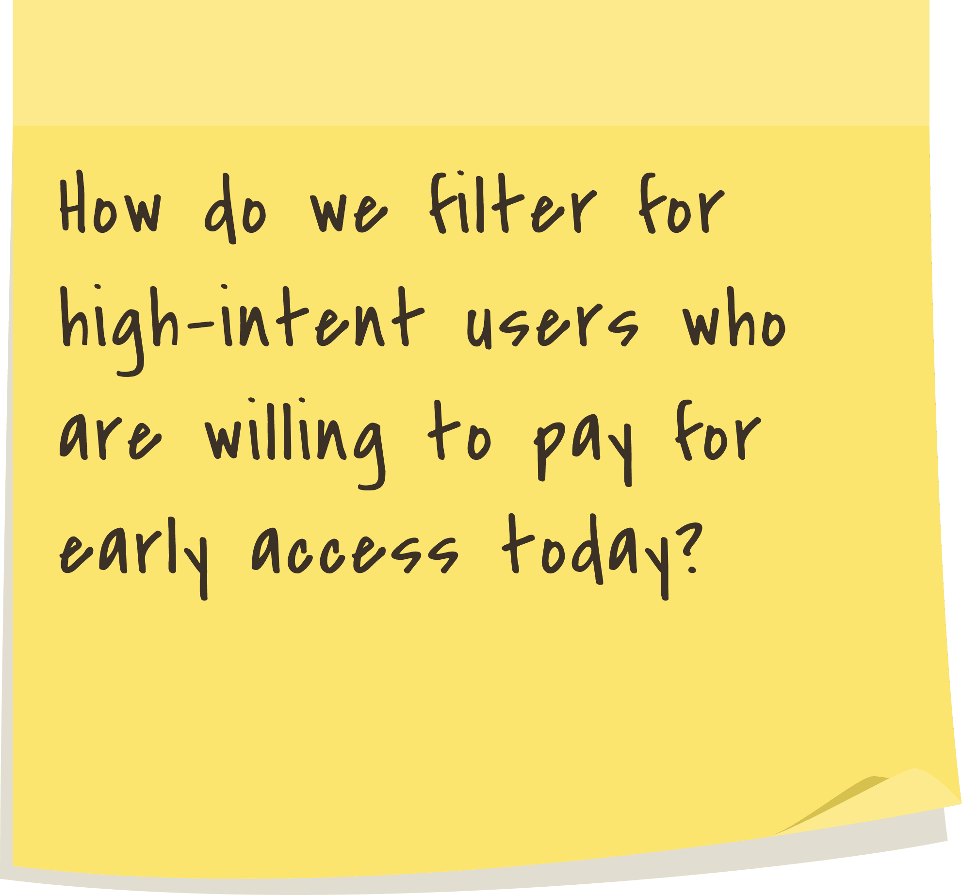
Researched Intentional Friction models to ensure the ₹699 reservation fee acts as a quality filter for believers.
[03] Visual Logic & Execution
Developed the Exploded Visual style to give users a "X-ray" view of the internal sensors and microphones.
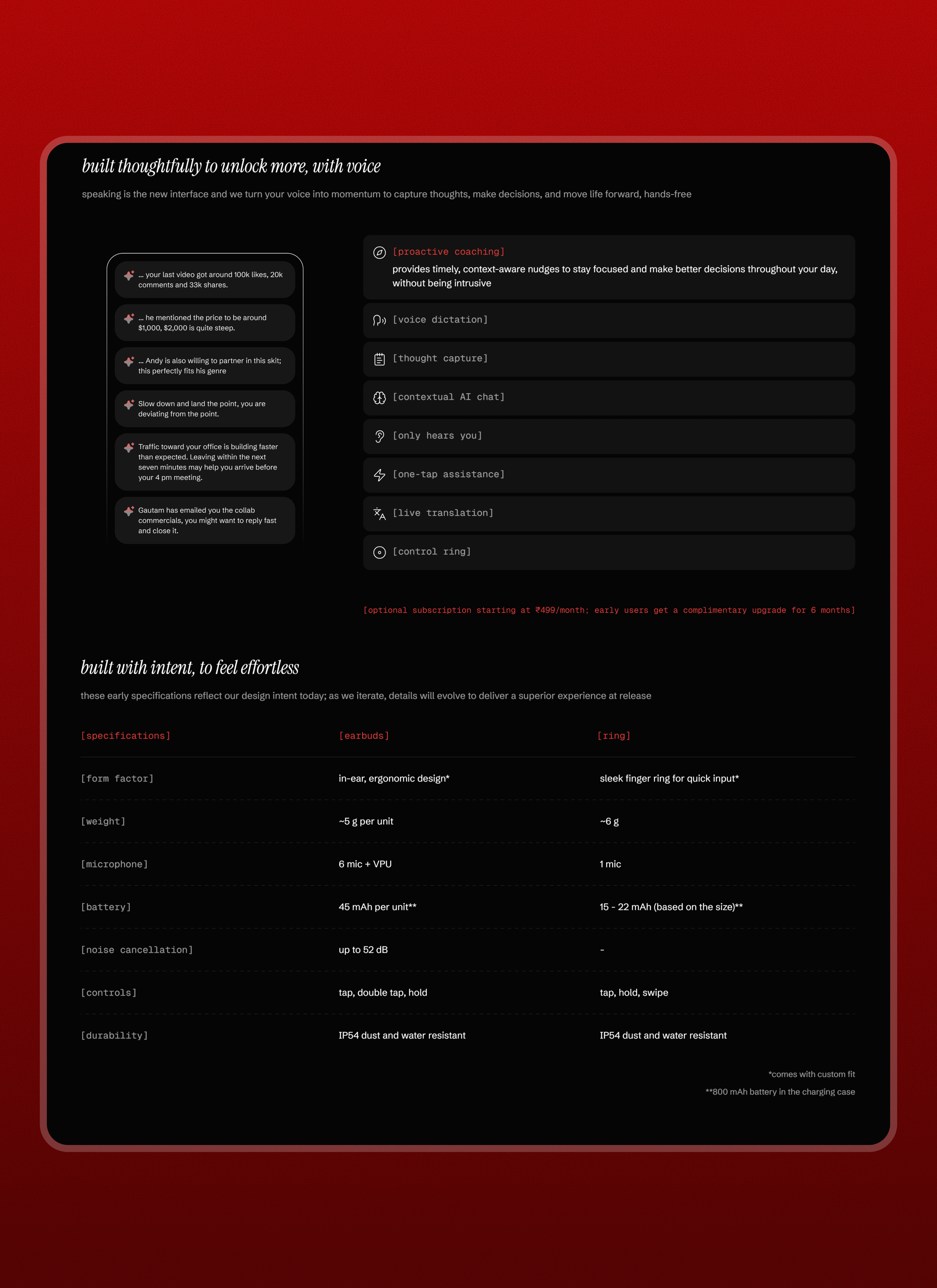
Designed a "Specs-First" information hierarchy to give the user enough logic to justify an emotional purchase.
Created a high-end, monochromatic UI system that reflects a philosophy of clarity and professional focus.
[04] Intentional Refinement
Structured the reservation flow to balance premium exclusivity with a clear, low-friction checkout.
Refined the typography and layout to ensure every technical detail felt high-end and grounded in reality.
Optimized the multi-page navigation to ensure the Mission and Technical Specs were always easy to find.
[Trade-offs]
Decision
Trade-off
Outcome
[Outcome]
Technical transparency turned skimmers into deep readers, achieving a 3m 14s average session. This significantly beat industry standards, proving users found genuine value in the technical blueprints.
Despite the ₹699 fee and lack of photos, the site maintained a 1.9% bounce rate. This confirms the design successfully filtered for high-intent buyers while keeping the broader audience engaged in the story.
The "Intentional Friction" and trust-building strategy allowed us to reach our 3-month pre-booking target in less than 2 months. This accelerated growth proved that the design successfully collapsed the "trust gap" for skeptical users faster than anticipated.
[Key Learnings]
Transparency is the ultimate trust builder
I learned that when you don’t have a physical product, honesty beats hype every time. By showing technical blueprints instead of hiding behind stock photos, I proved that users respect a brand that treats them like intelligent partners rather than just consumers.
Strategic friction improves lead quality
This project taught me that "easier" isn't always "better" in UX design. By adding a small reservation fee, we intentionally slowed the user down, which actually filtered for high-intent believers and ensured the business received high-quality commitments rather than empty email leads.
Design must sell the mission, not just the hardware
I realized that people don't just buy a device; they buy into a future vision. By designing a narrative-led roadmap, I was able to shift the conversation from what the product "is" today to what the company "will become" by 2031, creating long-term brand loyalty from day one.