Designing Software That Thinks Like an Expert
Seawolf helps professional surfers monitor ocean conditions and receive alerts when their ideal wave conditions appear. The challenge was making a complex expert workflow fast enough to complete and easy enough to return to.

[My Role]
Product Design Intern
[Project Timeline]
May 2025 - June 2025
[Project Scope]
Research • Product Strategy • UX/UI
[00] TL;DR
[01] The Product Journey
Seawolf helps professional surfers replace hours of monitoring weather, tide, and swell forecasts with personalized alerts for their preferred surfing conditions. The journey below shows where users dropped off before experiencing the product's full value.


[02] The Challenge
[03] Understanding the Mental Model
Before redesigning the experience, I wanted to understand how professional surfers make decisions in the real world. Three behavioral patterns consistently shaped the direction of the product.
Research was based on conversations with 6 professional surfers, including the founder, who also surfs competitively and represented a distinct persona. An additional 12 surfers were consulted indirectly through the founder's existing network, surfacing recurring language and preferences beyond the direct interviews.
[03.01] Research Finding 1

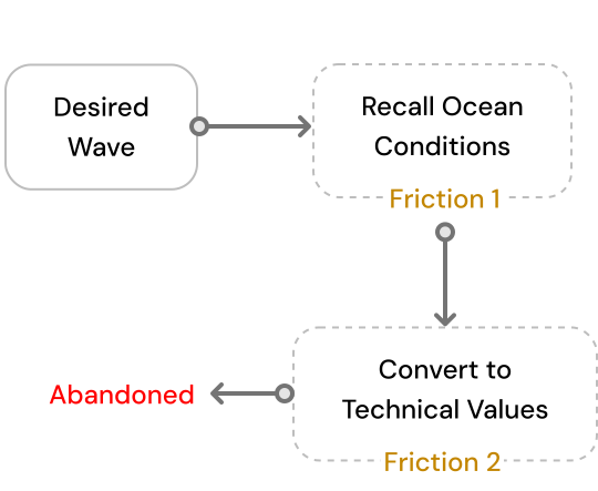
[03.02] Research Finding 2


[04] Concept Exploration
With the user problems clearly understood and finding the intervention points, I explored multiple approaches before deciding how the experience should work.
[04.01] Approaches for Challenge 1
Users select a surf profile, and the system automatically fills the required conditions.
Users select a surf location and wave type, then refine suggested conditions through visual inputs.
Split the setup into progressive steps without changing the workflow or way to take inputs.
**The final solution combined the strongest ideas from each approach: starting with the surf location and preferred wave, suggesting relevant default conditions, and allowing users to refine them through visual inputs such as maps, compass directions, and interactive controls.
[04.02] Approaches for Challenge 2
Send alerts using the app's native notification system repeatedly.
Surf Alerts are delivered through email.
Alerts are delivered through apps users already check throughout the day.
**Instead of expecting users to return to Seawolf, the final solution delivered alerts through messaging apps like WhatsApp. Since users already check these apps throughout the day, surf alerts naturally fit into their existing habits, reducing the chances of missed alerts while remaining simple and feasible to implement.
[05] Design Solutions
[05.01] Start with Context
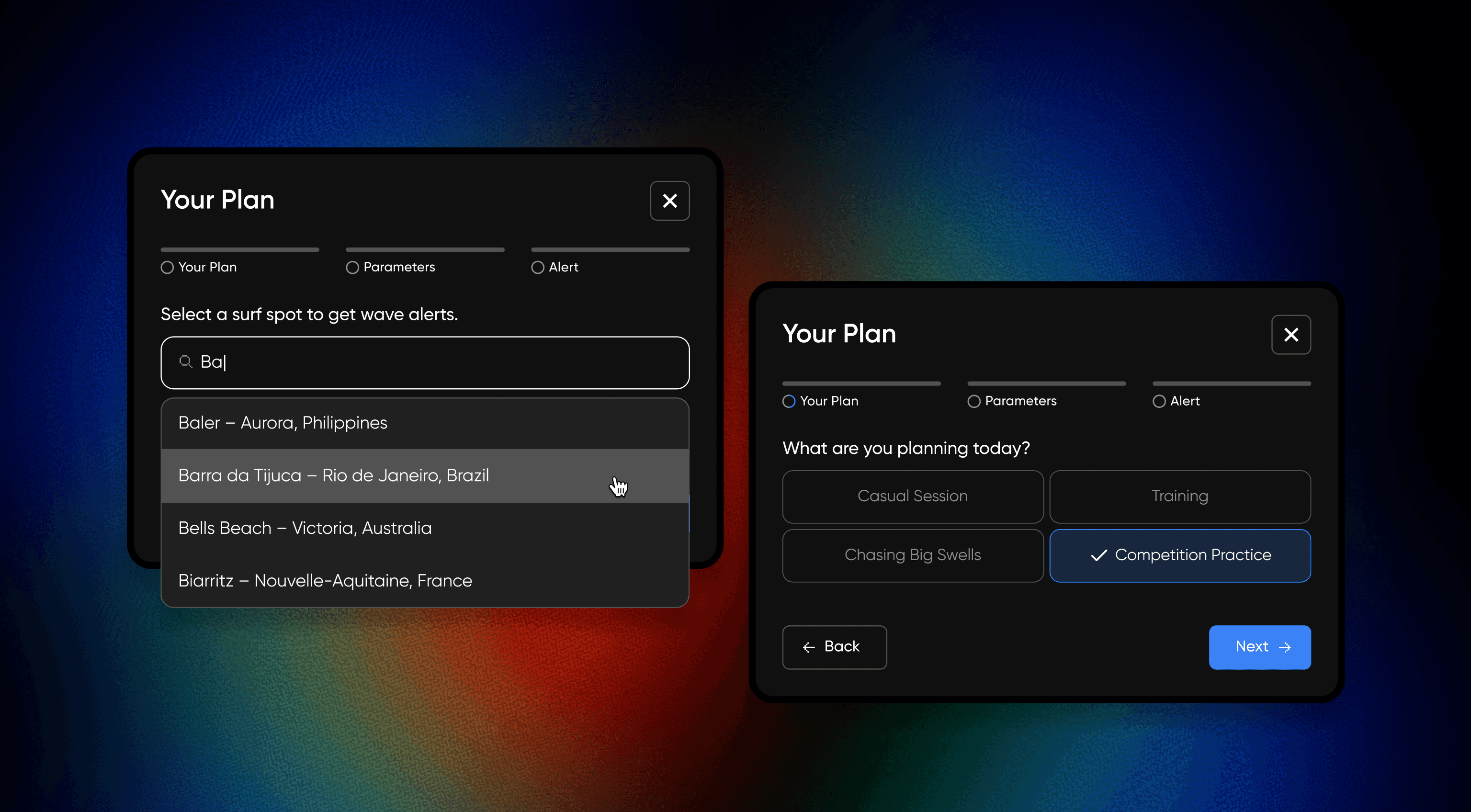
[05.02] Visualize Technical Inputs

Instead of asking users to imagine swell direction as degrees, the interface visualizes it through a map and compass, making technical conditions easier to understand and configure.
Trade off 1: Accepted a more complex interaction in exchange for reducing mental effort and improving accuracy during setup.
[05.03] Reduce Manual Configuration

[05.04] Deliver Alerts Through WhatsApp

Trade off 2: Prioritized reliable alert delivery over driving users back into the app, resulting in lower in-app engagement but higher alert visibility.
**Trade off: Brand vs. Usability
I recommended a light theme over the brand's preferred dark theme because surfers typically configure alerts outdoors. Although the final product retained a dark interface for brand consistency, the exercise reinforced the importance of prioritizing usability over visual preference.
[06] Impact
Alert setup time
First alerts creation
Average alerts per user
Higher return rate
**These metrics were measured between June and August 2025, immediately after launching the redesigned experience. Because Seawolf serves a global user base, swell seasons vary by region rather than aligning to one calendar window, which reduces the risk of seasonal bias in these numbers.
[07] Reflection